Building an Updated Dual-Screen Surf Forecast Dashboard for Santa Cruz
I’ve been working on a custom surf forecasting dashboard designed around the way I actually check the waves in Santa Cruz. Instead of bouncing between Windy, Surfline, tide charts, swell models, and board choices, I wanted one clean setup that pulls the important information together and helps answer the real question:
Where should I surf, when should I go, and what board should I bring?
The result is a dual-screen surf dashboard built for a dedicated display setup. One screen runs a live Windy map with a custom forecasting overlay, while the second screen runs Surfline full-screen for cams, reports, and final visual confirmation.
The goal was not to replace surf intuition, but to create a smarter starting point.
Why I Built It
Santa Cruz has a lot of variables packed into a small area. The Hook, Pleasure Point, Steamer Lane, Capitola, Four Mile, and 38th can all react differently to the same swell. Swell direction, period, wind, tide, and even the type of board you’re riding can completely change the call.
Most forecast tools show the data, but they do not necessarily interpret it around my actual preferences.
For example, I do not surf 38th all that often, even if it scores well on paper. I usually prefer The Hook, but also enjoy Steamer Lane, Pleasure Point, and Four Mile. My two main boards right now are the Roger Hinds Dream Fish and the Vernor Roadster, with a few other boards available when the conditions call for them.
So I wanted the dashboard to reflect that.
What the Dashboard Does
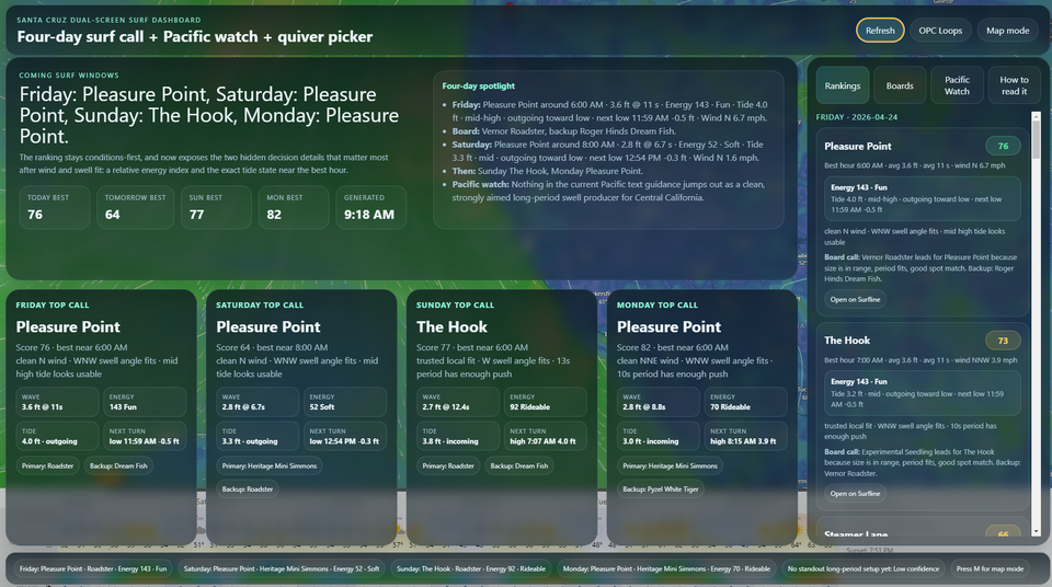
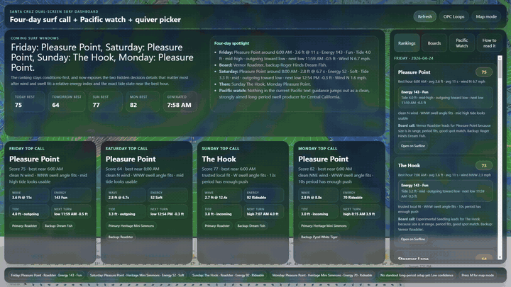
The dashboard ranks surf spots for the upcoming forecast windows and gives a practical “top call” for each day.
Right now it focuses on:
- Friday
- Saturday
- Sunday
- Monday
- Tuesday
- Thursday
Each day shows the recommended spot, best approximate time, score, surf size, period, wind, swell angle, tide behavior, wave energy, and board recommendation.
The dashboard also includes a Pacific Watch section to help identify potential swell-generating activity farther out in the Pacific. This is useful for seeing whether there are action points that might send better WNW/NW energy toward California in the coming weeks.
The Main Screen
The main screen is built around Windy. I wanted the wind map to remain the visual anchor of the whole system because large-scale wind patterns and pressure systems are one of the best ways to understand what might be coming.
Over the Windy map, the dashboard displays a modern translucent forecast overlay. The overlay includes:
- daily top calls
- spot rankings
- board recommendations
- tide detail
- wave energy
- Pacific storm watch
- interpretation notes
I also added a Map Mode, which hides the forecast panels so the Windy map can be viewed clearly. This was important because the original overlay looked great, but it blocked too much of the wind visualization. Now I can quickly hide the data, study the map, and bring the forecast panels back when I’m ready.
The Second Screen
The second screen runs Surfline full-screen.
This keeps the workflow simple:
Screen 1: Windy map, forecast logic, rankings, tide, energy, board picker
Screen 2: Surfline cams and reports
The dashboard makes the recommendation, and Surfline gives the final visual check.
Surf Spot Preferences
The dashboard is tuned around my current Santa Cruz preferences.
My favored spots are:
- The Hook
- Steamer Lane
- Pleasure Point
- Four Mile
38th / Jack’s is still included, but it is intentionally deprioritized unless the conditions are clearly better there.
That makes the dashboard feel more realistic. It does not simply tell me which spot has the highest generic score; it helps me make a call based on where I actually like to surf.
Current Quiver Built Into the Dashboard
The dashboard also includes my current board quiver:
- Vernor Roadster — 7'2" x 21.25" x 2.75" | 47L
- Roger Hinds Dream Fish — 6'3" x 21" x 2.75" | 39L
- Pyzel White Tiger — 6'4" x 21 1/2" x 2 7/8" | 44.1L
- Vernor Heritage Mini Simmons — 5'10" x 22" x 3.17" | 46L
- Experimental Seedling — 5'11" x 20 1/4" x 2 3/4" | 36L
The board logic is weighted toward the boards I actually ride the most:
- Dream Fish
- Roadster
- Other boards when conditions specifically call for them
The Dream Fish gets preference when the waves are clean, workable, and fun. The Roadster gets preference when I want more paddle, more glide, or more forgiveness. The Mini Simmons, White Tiger, and Seedling come into play when the conditions are especially suited to them.
Wave Energy and Tide Detail
One of the most useful additions was adding a visible wave-energy layer.
The dashboard uses a simple surfer-style shortcut:
Energy ≈ wave height² × period
It is not meant to be a perfect scientific model, but it gives a quick way to understand whether the surf has real push or is just visually waist-to-chest high without much power.
The dashboard also shows tide behavior more clearly now. Instead of vague labels like “holding,” it uses more useful language such as:
- incoming toward high
- outgoing toward low
- holding high
- holding low
This makes the forecast easier to interpret quickly. For example, a spot may have the right swell and wind, but if the tide is draining too fast or getting too high for that break, the dashboard can help make that obvious.
Why This Is Useful
The dashboard is not trying to make the decision for me. It is trying to compress the decision-making process.
Instead of asking five separate questions:
- What is the swell doing?
- Is the wind clean?
- What is the tide doing?
- Which spot likes this swell direction?
- Which board should I bring?
The dashboard pulls those pieces together into one practical call.
A good forecast card might read something like:
The Hook — best near 7:00 AM
Clean NE wind, WNW swell angle fits, 3 ft at 11 seconds, rideable energy, incoming tide, Dream Fish recommended.
That is the kind of information I actually want when deciding whether to load the car before work or plan a weekend session.
Tech Setup
The dashboard is built as an Electron app for a dual-monitor Windows setup.
The current version uses:
- Electron desktop app
- Windy map display
- Surfline full-screen second display
- Open-Meteo marine forecast data
- NOAA tide data
- NOAA / OPC Pacific weather guidance
- custom Santa Cruz spot scoring
- custom quiver recommendation logic
It is designed more like a dedicated surf command center than a normal website.
Final Thoughts
This project started as a simple dual-screen Windy and Surfline display, but it has evolved into something much more useful: a personalized Santa Cruz surf decision dashboard.
It reflects the way I actually surf, the boards I actually ride, and the spots I actually prefer.
The most important part is that it keeps the visual forecast front and center. The Windy map still shows the bigger Pacific picture, Surfline still gives the cam confirmation, and the custom overlay helps translate the data into a practical call.
For now, I consider this version locked in.
It is not just a forecast dashboard anymore. It is a personalized surf planning tool.